File Preview
As the name suggests, a File Preview component provides an area on the Page where the Preview of a File is visible.
Where does a File Preview component appear?
You can find the File Preview Component:
- In the Files Tab at Individual Item Level - Here the File Preview component appears as integrated with the File Browser component and can appear as default.
- Any other Page - Here the File Preview component may appear with Attachments, Embedded Files or File Browser component.
Although the purpose of the File Preview component is same irrespective of on which page it appears, there are some subtle differences in its features.
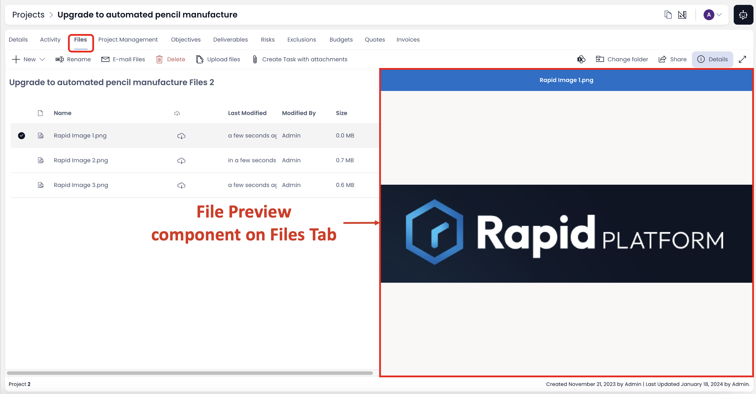
File Preview Component on Files Tab
Please consider the following points:
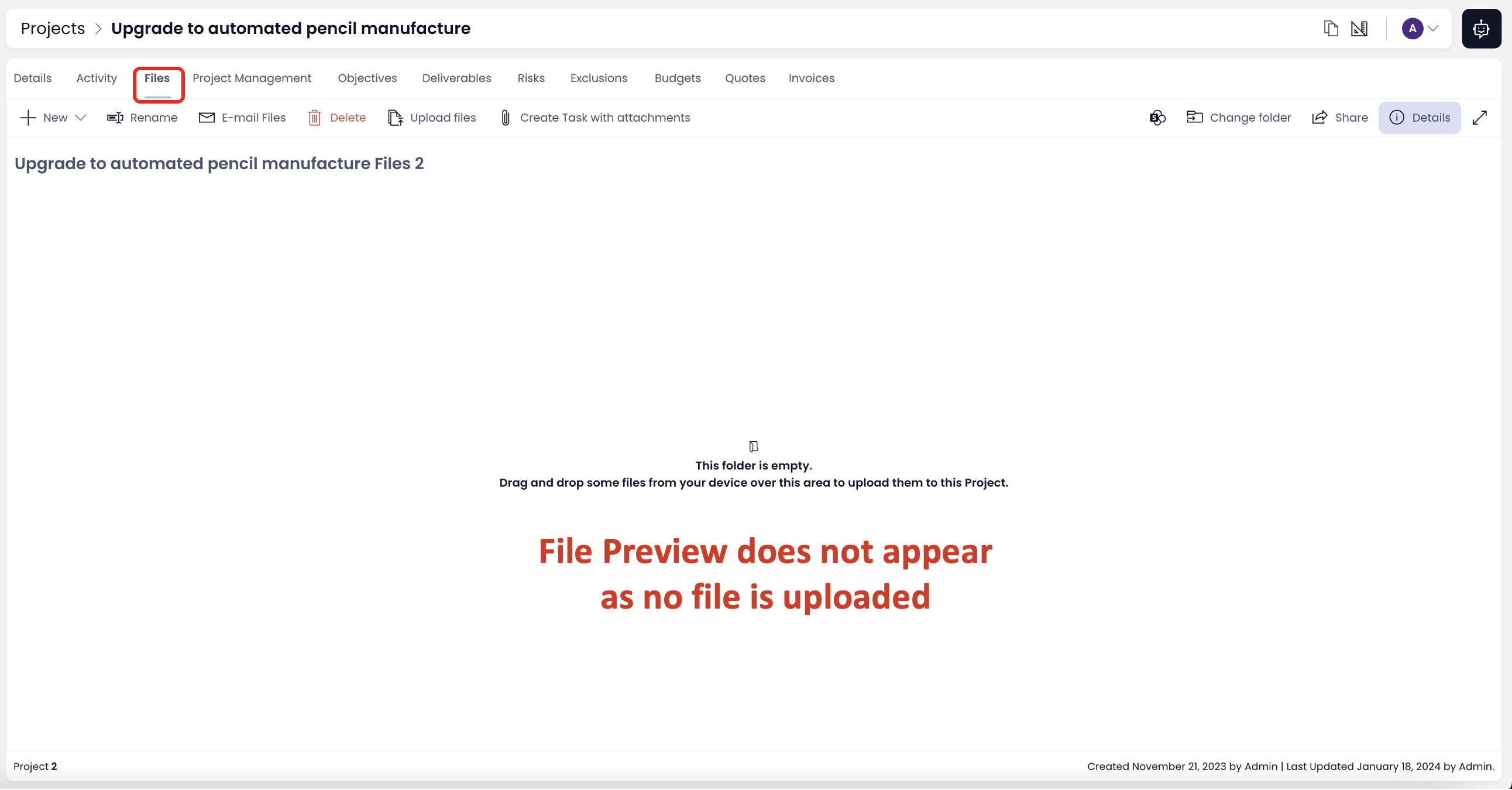
- If there are no files uploaded in the Files Tab then the File Preview component does not appear on the screen.
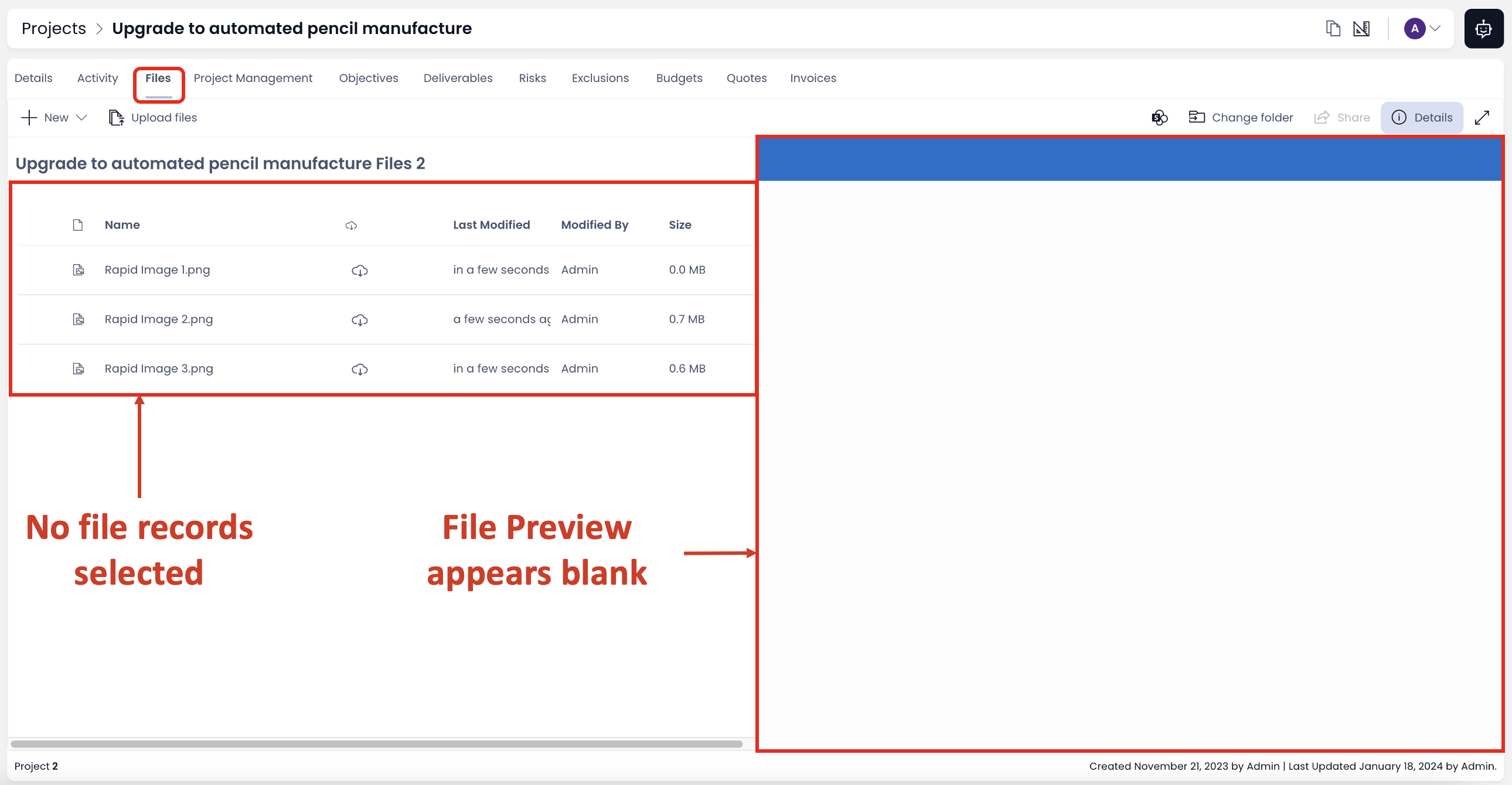
- If the files are uploaded but none of the files is selected, then the File Preview appears as blank.
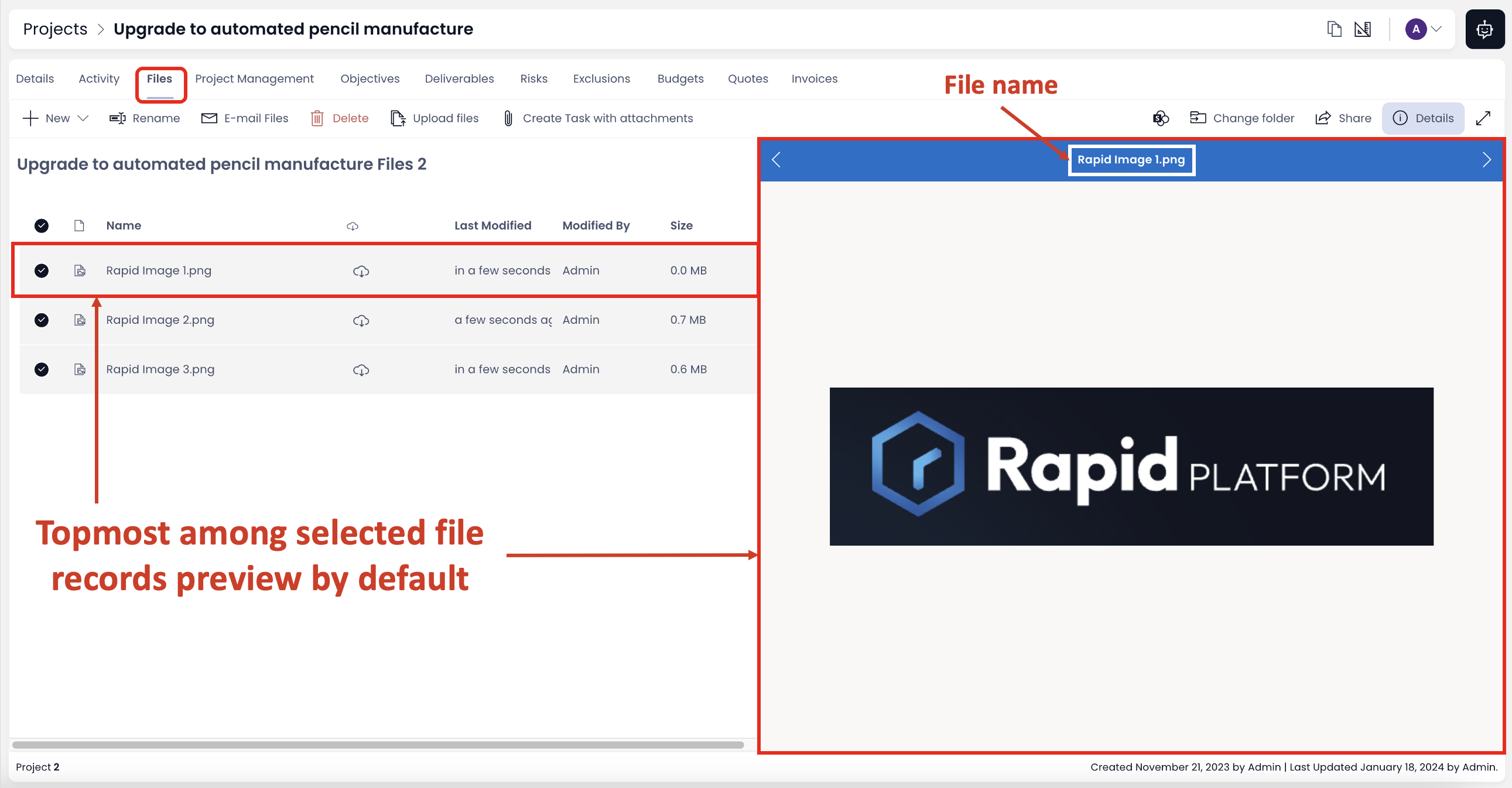
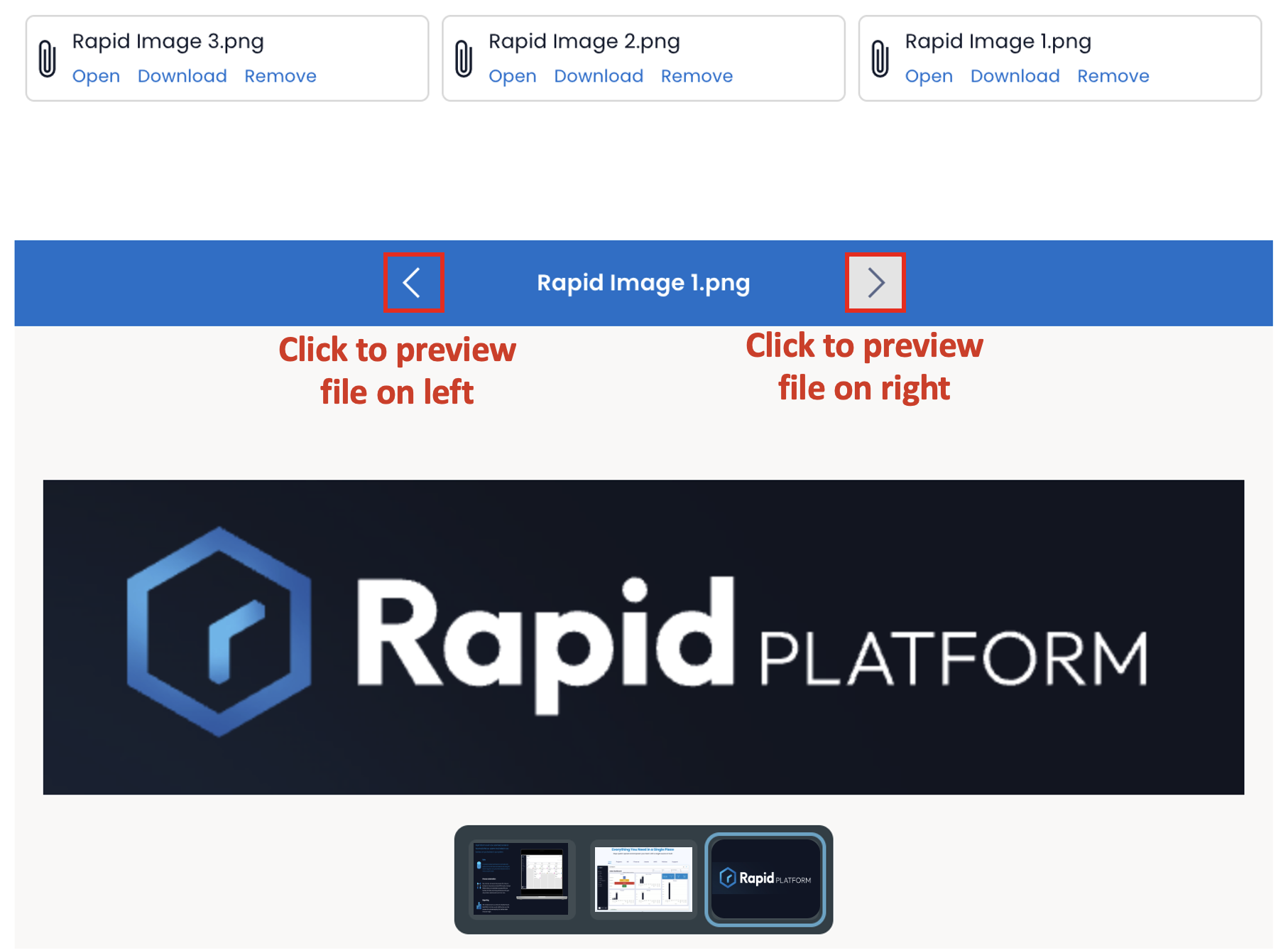
- If more than one file records are selected then (by default) the component will show the preview of the file which is the topmost in the selected list.
- To preview other selected files, use the arrow key (highlighted in the image below). Pressing the right arrow button will show the preview of selected file immediately below the subject file. Pressing the left arrow button will show the preview of selected file immediately above the subject file being previewed.
For example - In the image below, if file "Rapid Image 2" is being previewed, then:
a) Pressing right arrow button - shows "Rapid Image 3" preview
b) Pressing left arrow button - shows "Rapid Image 1" Preview
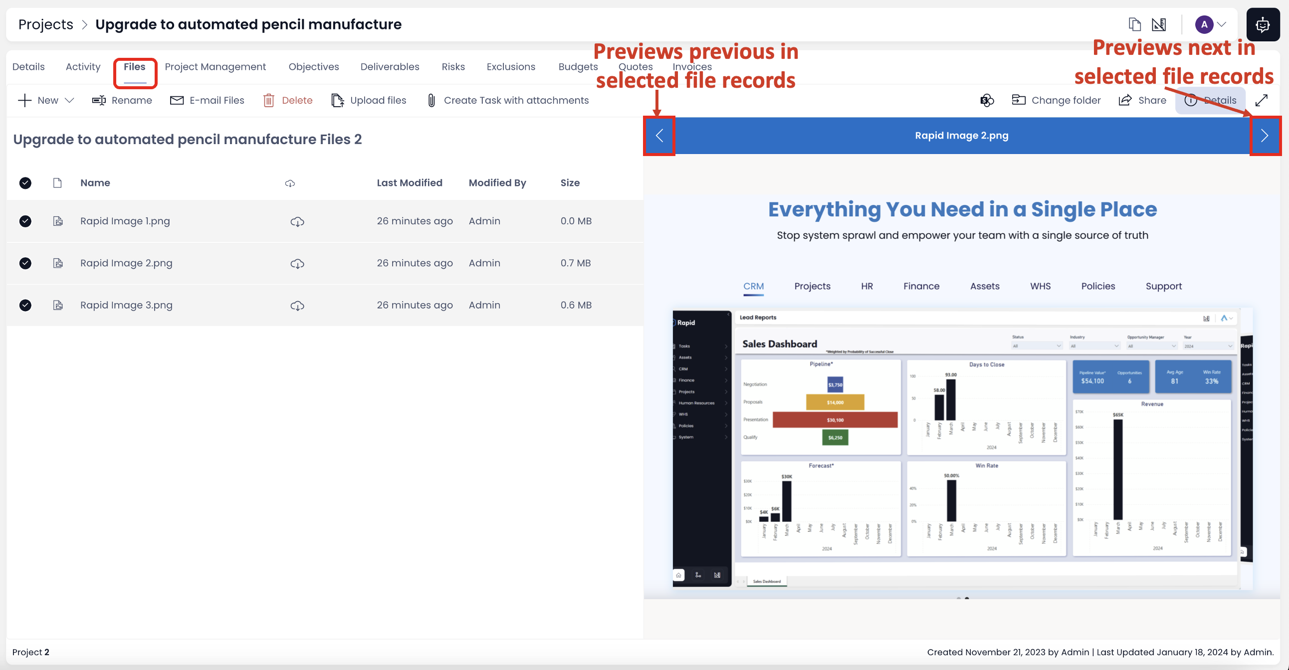
If you have reached the top of the selected files stack, pressing left arrow button will show preview of bottom most selected file.
Similarly, if you have reached the bottom of the selected files stack, pressing right arrow button will show preview of top most selected file.
-
The title of the file being previewed is shown on the top of the preview area, in a blue ribbon.
-
You can enter full screen more by clicking on the expand icon (shown in image below).
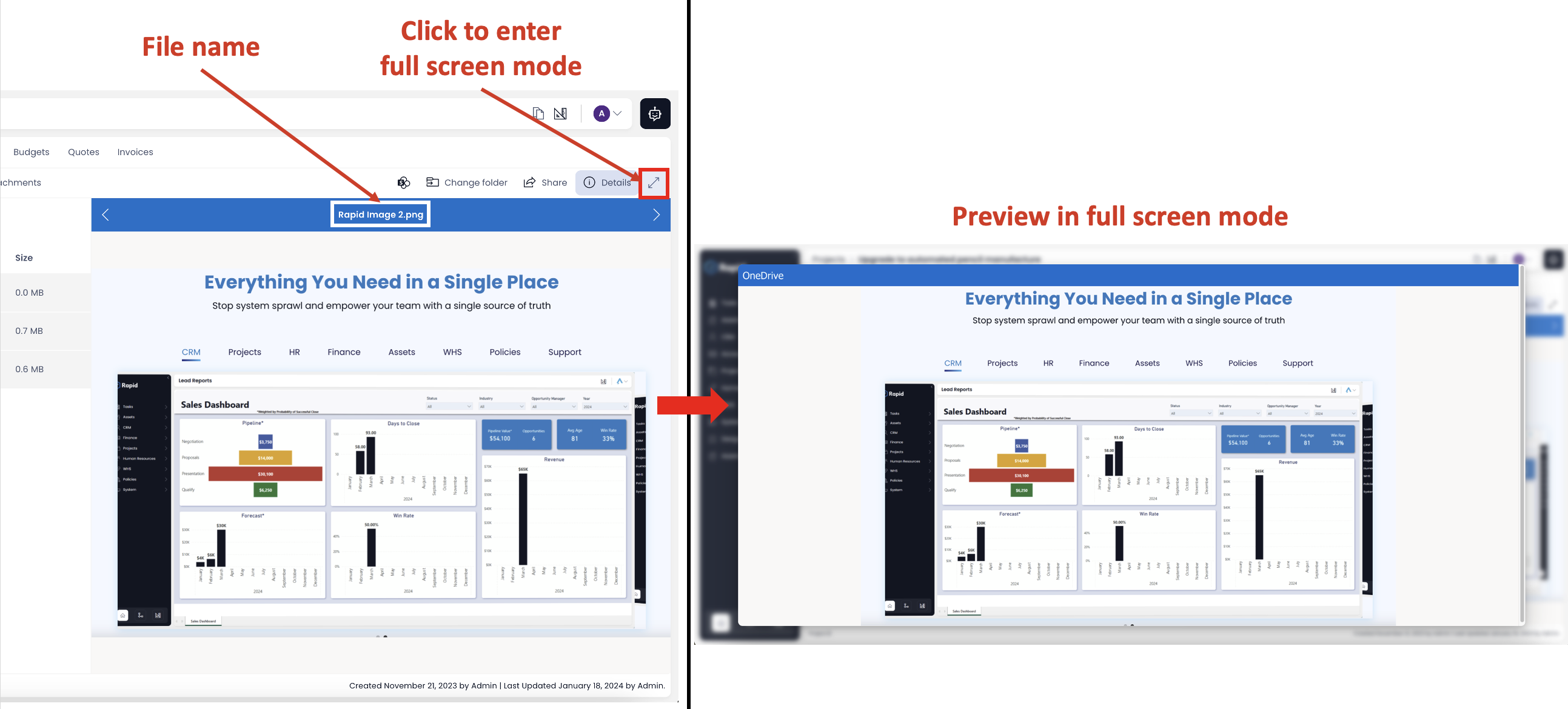
To exit full screen mode, press Esc on keyboard.
- You can close / open the File Preview component by clicking on the "Details" button.
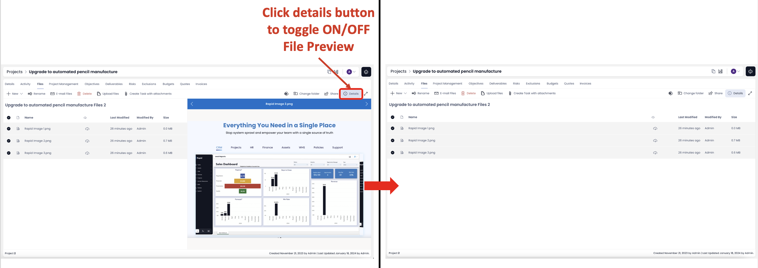
The size and position of the File Preview component appears by default here and is always consistent.
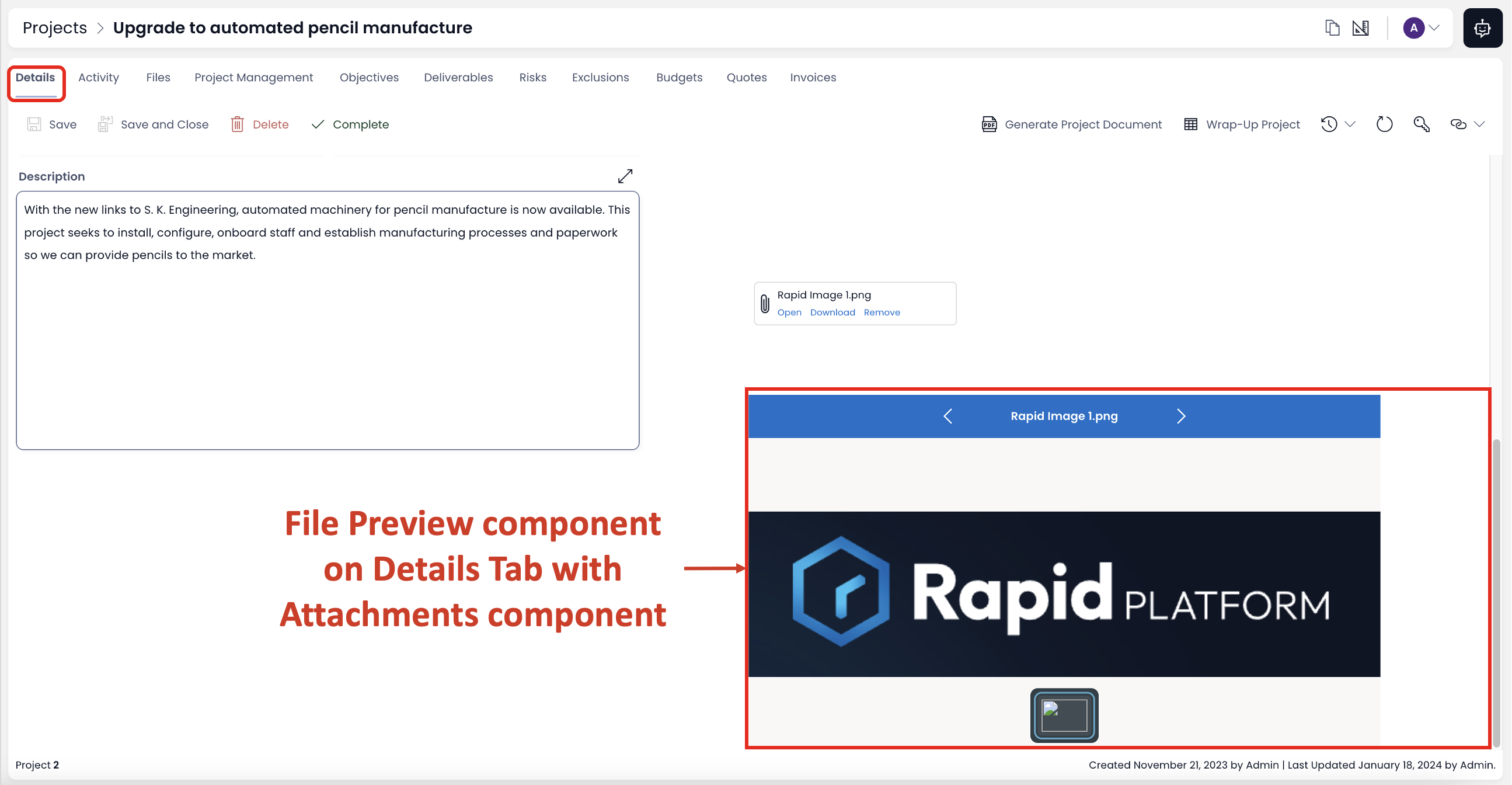
File Preview Component with Attachments / Embedded Files component
Here we are taking illustration of Attachment component with File Preview component on Item Details Page. It can be on any other Page and with Embedded Files component. The below discussions remains same.
Please consider the following
- If there are no files to preview, a logical message is displayed (in Explorer) as below:
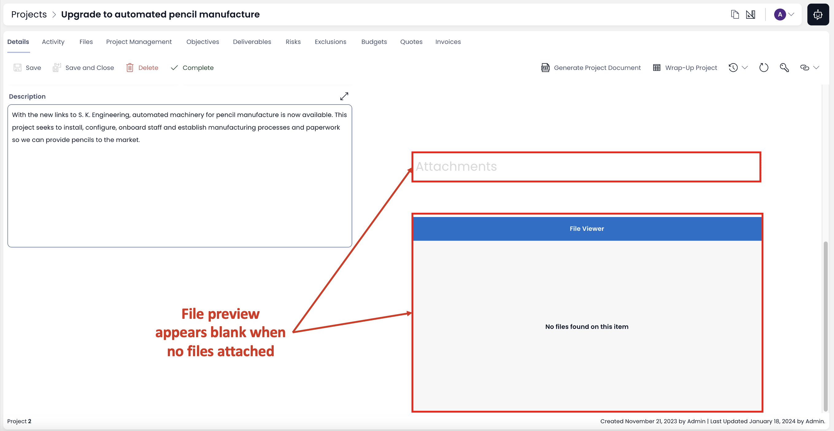
The above message will appear if:
- There is neither an Embedded File component nor an Attachment component present - it is necessary that at least one of these two components is present on the Page (configured in Designer).
- The Embedded Files and/or Attachment component are present but do not have any file added - even with the components added in Designer, it is important that there should be at least one file to display in preview.
- You do not need to select a file record to preview it. Be default the first file is previewed.
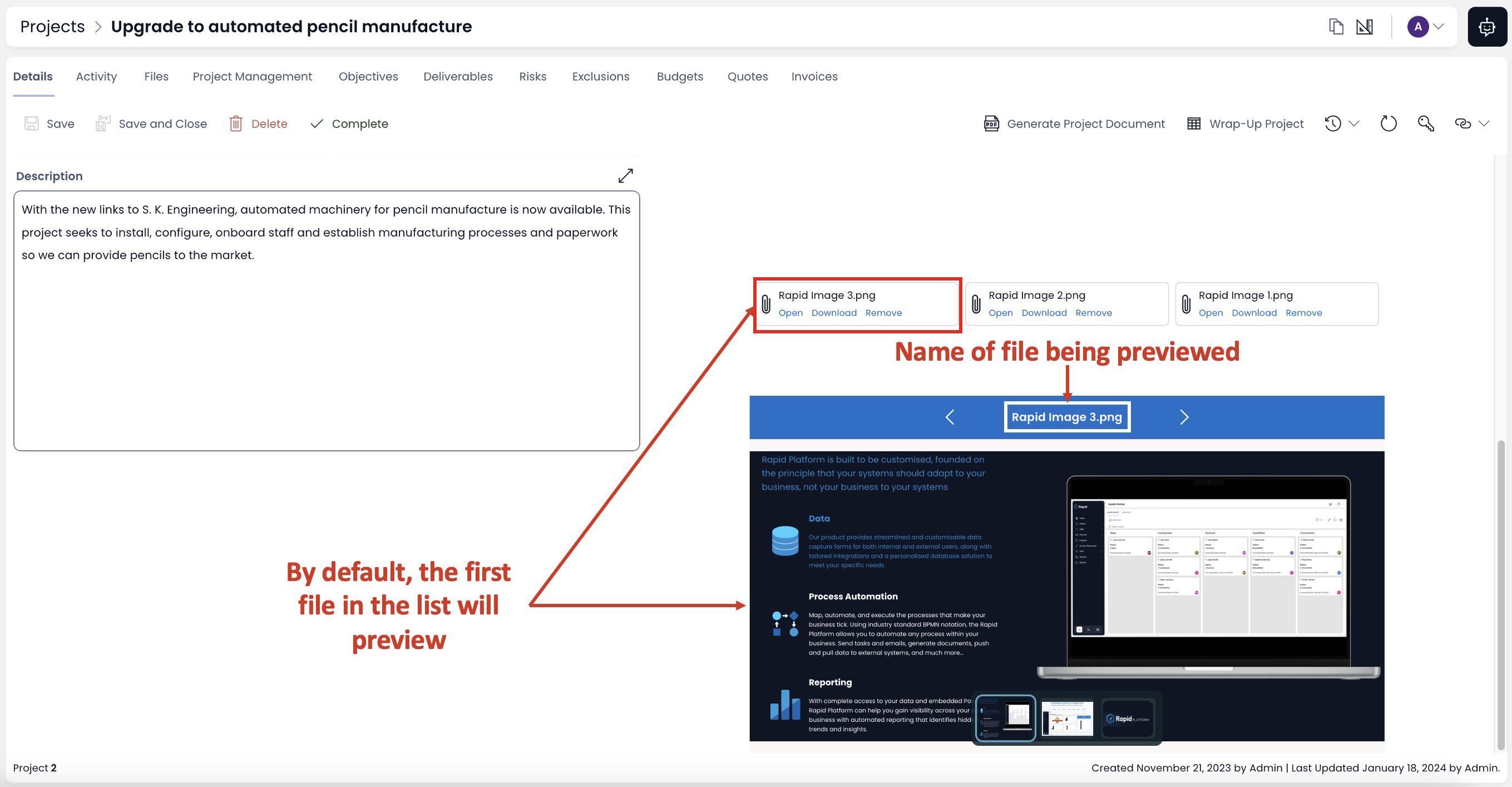
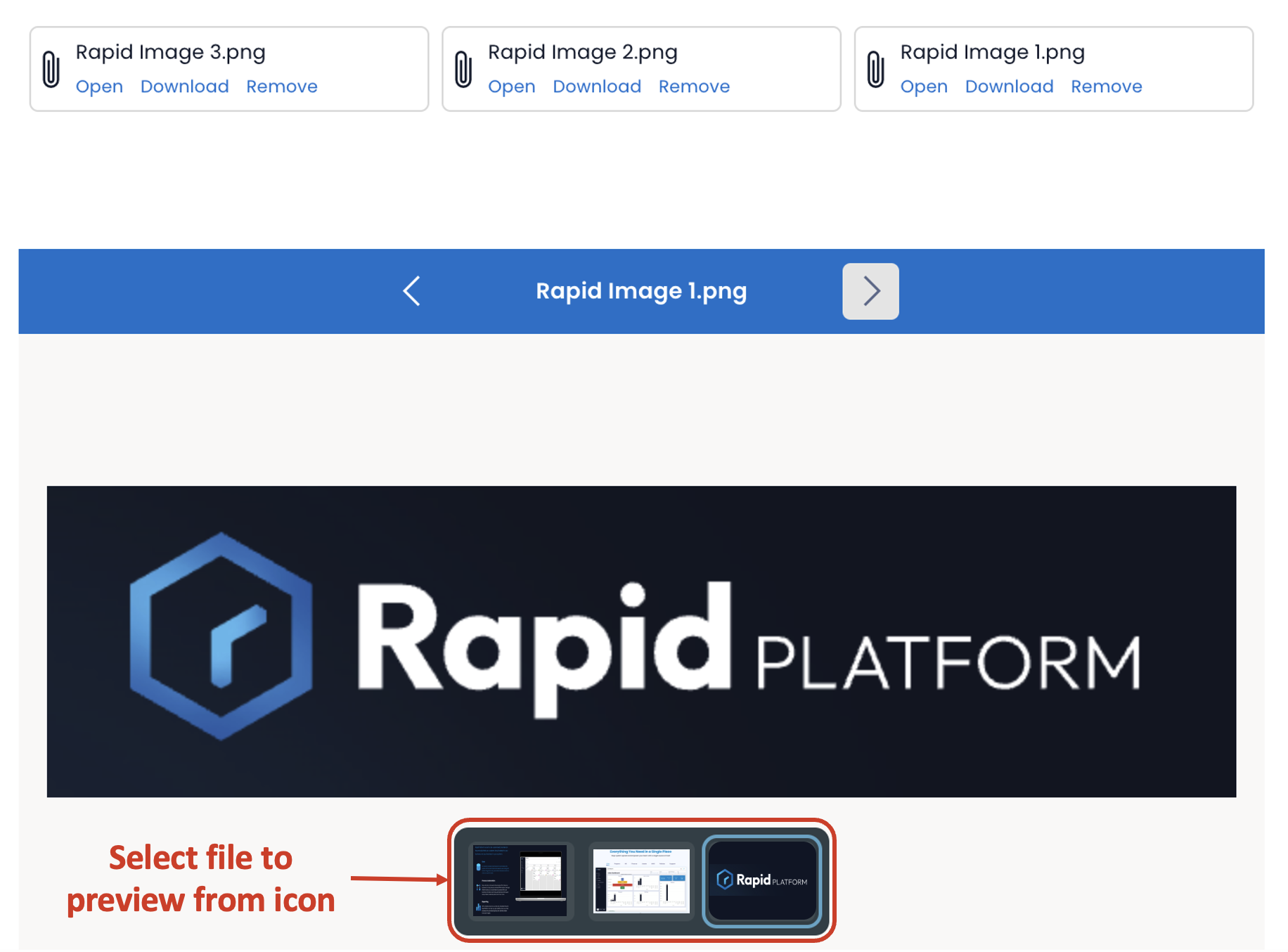
- If there are more than one files attached, then the preview appears as carousal. You can click on the arrow buttons to scroll right or left (as discussed in previous section). You can continuously scroll to left or right in the carousal and the files for preview will get selected sequentially.
While arrow keys allow you to sequentially preview files, you can use the preview icons at the bottom of the Component to select your desired file to preview. This can be particularly useful if you have a large number of files attached and going sequentially can be tedious.
-
Just as depicted in previous section, the name of the file being previewed is displayed on the top of the component.
-
Unlike Files Tab, you cannot Toggle OFF / ON Files Preview component in Explorer.
Here you can find File Preview component in different size and positions. This would appear as defined in Designer.
Additional File Components
Rapid Platform has several additional components that are useful for storing and manipulating files. Other useful components include: